Remember Part I of my
Kaisercraft Journal Planner Review? Well, I'm back with part II using primarily Kaisercraft items and focusing mainly on using just the white pages given. Sometimes with our hectic lives, it's easier to just go with the flow and use what we have. If we have the time, sure, we'll be able to spice things up a whole lot more. But for the mums, the university students, and the working heroes, here's a look into how you can spice your pages up with just a little bit of washi, paper and of course, creativity:
I decided to use my Kaisercraft Journal planner to document my month of October. It's still a working progress with my journaling yet to be filled in. But to give you an idea of how it looks like and the different layouts you can employ in your planners, here are a few pictures:
For the first week of October, I decided to use two different sets of Kaisercraft papers. The yellow on the left is from the Shine Bright range. It's full of yellows, greys and blacks. In conjunction with their collectables and you'll have a full spread in no time. The yellow Project Life cards on the right is from Kaisercraft's new upcoming collection My Year, My Story. Their paper pack is filled with varying colour themes that are perfect when collaborated with the journal planner. Here's a little close up of the page:
Here's a look at the next set of pages:
I actually love the black and white cards supplied in the My Year, My Story kit. Because it's plain, it allows you to work around it and be creative. I applied some yellow watercolour behind my picture on the top left corner of the page, and plan on using my typewrite to write out strips of stories to stick in. The left page is just your weekly planner / journal page. Like my Midori, I tend to write little stories in those boxes and stick in an extra piece of picture on the side just so I can break up the monotony of a journal page.
And a closer look at the Project Life spread on the left:
The next week took on a nature / wood theme:
I used another Kaisercraft kit for the page on the left called Limelight, which worked beautifully with my flower photo. I stuck on a piece of ephemera on top with 3D foam dots below to give it some dimension, and stuck a Kaisercraft sticker down the bottom.
The pocket photo spread used mainly Crate Paper's Notes and Things collection. I just love how well they match with the theme of it all. The top right flower patterned paper was from Heidi Swapp's Wanderlust collection.
The next page:
Just like the page before, I stuck on a picture on the side with a little embellishments and left the rest of the space blank for my upcoming journaling.
The next set of pages would have to be my fav:
I was staying in Geelong for a week when the weather was just beautiful. There were blue skies, sunshine and great weather all round. It was perfect for me to wander around and snap pictures of the harbour and beach that made it into my journal planner.
I used a variety of items in my spread on the left, but mostly are still from Kaisercraft. I used sticker sheets from a variety of Kaisercraft kits and used the potted plant ephemera from the My Year, My Story collectables pack. The one thing I absolutely love about the collectables pack is it contains ephemera in which you can colour in to your heart's desire. Yes, colour in ephemera, how cool is that?!
The back of the spread looked like this:
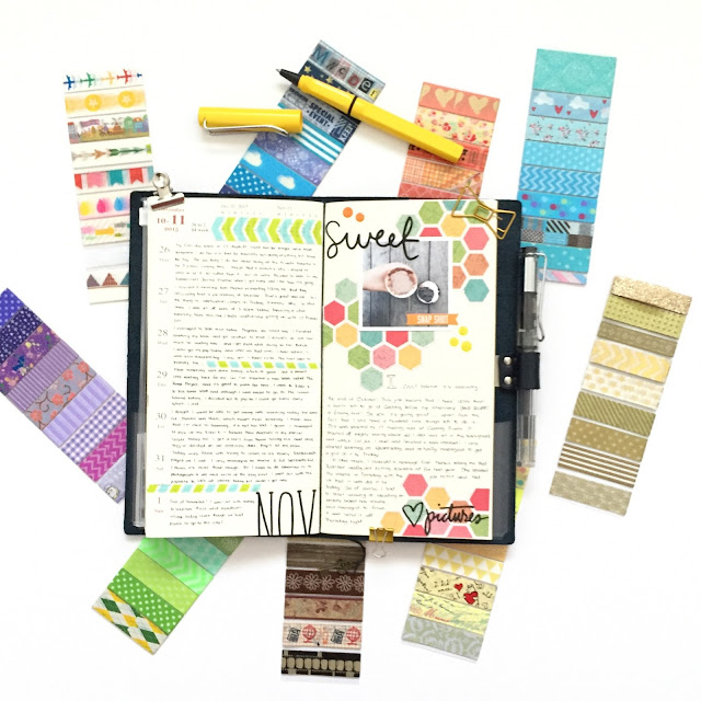
I think I'm highly in love with the hexagonal patterned paper from Kaisercraft's collection. I love how you can cut around the hexagons to create shapes and patterns in any way you want. I love it so much, I've employed the same technique in this week's MTN layout (which you can check out soon!).
Here's a little close up:
Overall, I've loved working in my Journal Planner. I can't believe it's already November, but that just means that when you wake up tomorrow morning, these lovely planners will be in store ready to be filled with creativity! Check out my previous blog post
here for prices, deets of the actual planner and more ideas!


